Unifying Design for a top-ten financial services firm
Case Study
While working for a top-ten financial services, public accounting, and consulting firm, I had the opportunity to serve as the UX Design Systems Lead. This case study outlines the process of creating a comprehensive design system that: harmonized two distinct component libraries, improved user experience, established brand consistency, and streamlined design workflows.
Project Background
Crowe's digital landscape had evolved over time, resulting in two disparate component libraries developed independently within different teams. These libraries had distinct design languages, dramatic aesthetic variation, and inconsistencies in UI elements and user experiences across Crowe's web and mobile applications. The challenge was to merge these libraries into a single, scalable design system built around best practices, principles and standards that could serve as the foundation for Crowe's digital assets.
Below you'll see two consulting service pages that were produced from the two different component libraries each containing their own unique visual language.
Objectives
Unify the design languages of two existing component libraries.
Establish a scalable and modular design system (in Figma and Code)
Incorporate variable typography to enhance readability and flexibility.UX-Brand Designer Liaison
Implement an 8pt grid methodology for consistent layout and spacing.

Research & Analysis
The project began with an extensive review of both existing component libraries. This involved analyzing UI patterns, color schemes, typography choices, and interaction styles. Stakeholder interviews and user feedback were also gathered to understand pain points and identify key requirements for the new design system.
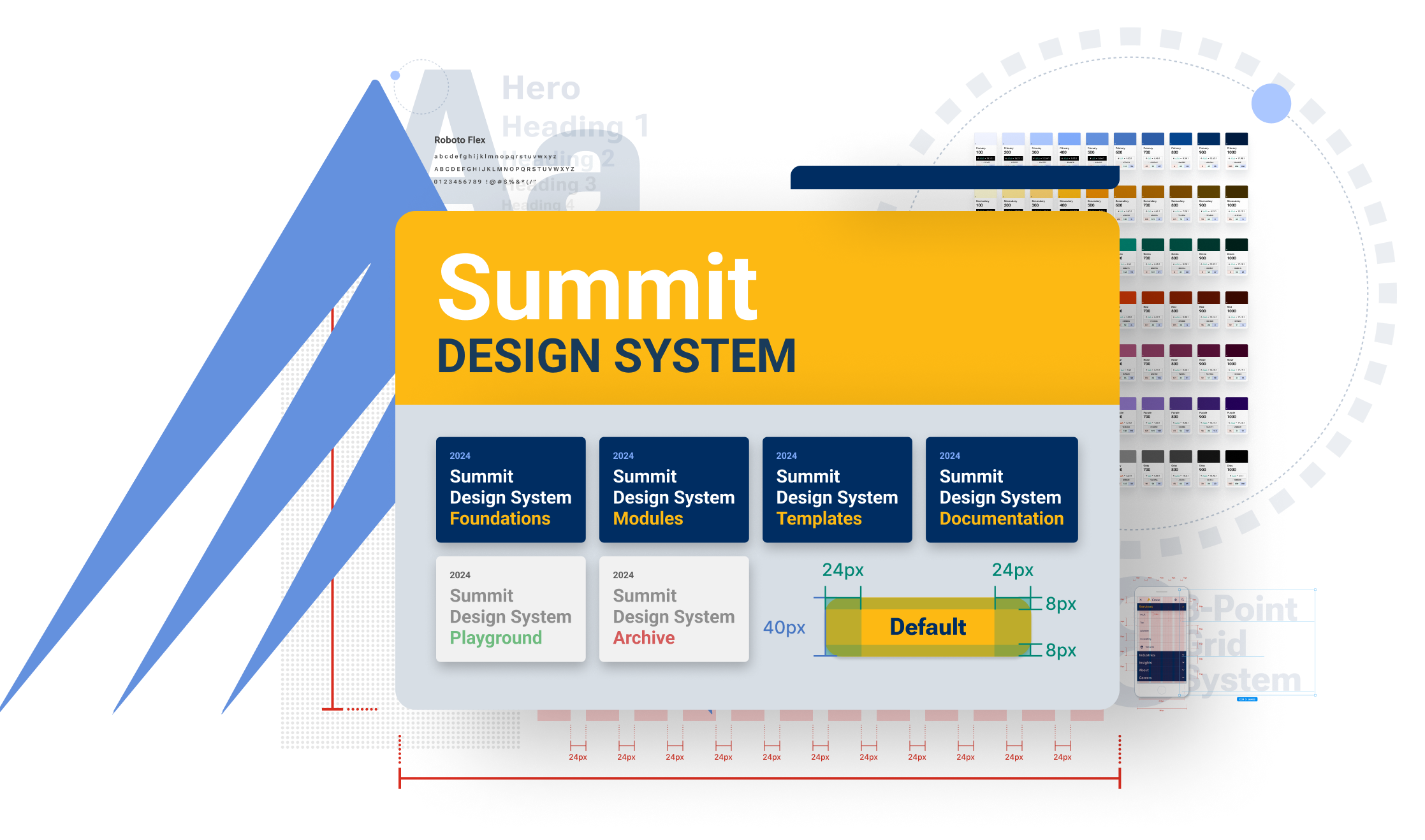
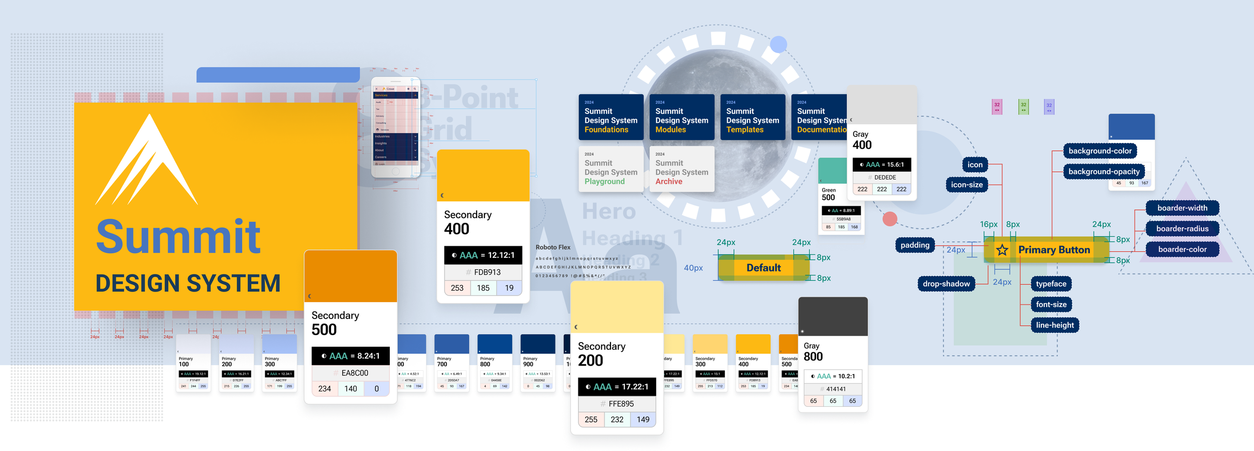
Design System Architecture
Using Figma, the team structured the design system based on atomic design principles. Components were categorized into atoms, molecules, organisms, templates, and pages. This structure enabled easy navigation and scalability as the system expanded.

8-Point Grid
All layout, sizing, and spacing decisions adhered to an 8pt grid system. This method provided consistent alignment and spacing between UI elements, promoting a harmonious visual rhythm throughout Crowe's digital assets.

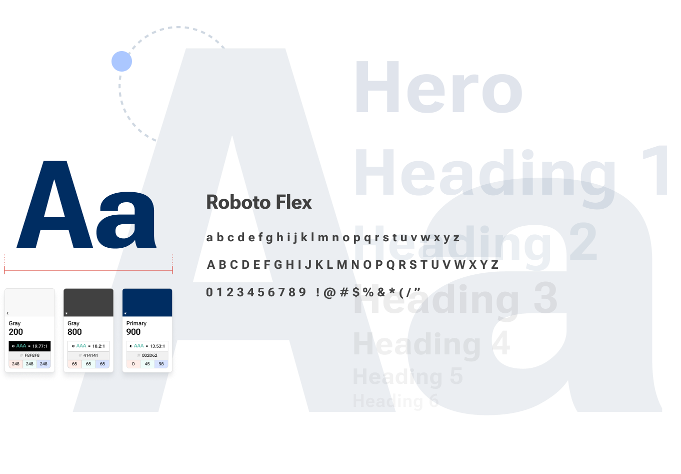
Variable Typography
Variable fonts were integrated into the design system to enable greater typographic flexibility. This allowed for dynamic adjustments in font weight, width, and other parameters, optimizing readability and aesthetics across different screen sizes and resolutions, while also increasing site performance and page load speeds.
Token-Based Styling
To ensure consistency and flexibility, a comprehensive set of design tokens was established within Figma. These tokens controlled colors, typography styles, spacing, and other design properties. By utilizing tokens, designers could make global changes efficiently across the entire design system.

Accessibility
Accessibility was a core focus in the development of Crowe's unified design system. The design system ensured compliance with accessibility standards such as WCAG by ensuring color contrast ratios for readability and providing clear focus states on interactive elements. Semantic HTML elements and appropriate ARIA roles were utilized to enhance compatibility with assistive technologies, ensuring accurate interpretation and navigation of content. Regular accessibility testingds throughout the development process helped identify and address issues related to keyboard navigation, screen reader compatibility, and proper image alt text. By integrating accessibility considerations, Crowe's design system aimed to create more inclusive and user-friendly digital experiences for individuals with diverse abilities and needs.

Testing & Iteration
The design system underwent rigorous testing to ensure its usability and effectiveness. Designers and developers collaborated closely to identify and address any inconsistencies or usability issues. Iterative improvements were made based on real-world usage scenarios and feedback from end-users.
Conclusion
The implementation of the unified design system brought several significant improvements to Crowe's digital products:
Consistency: UI elements and interactions became more cohesive and aligned across platforms.
Efficiency: Designers and developers experienced increased productivity due to streamlined workflows and reusable components.
Scalability: The modular structure of the design system allowed for easy expansion and adaptation to evolving design needs.
Brand Cohesion: Crowe's brand identity was reinforced through consistent design language and visual elements.
Accessibility: Enforcing color contrast ratios, providing clear focus states on interactive elements, using semantic HTML and ARIA roles.
By combining two disparate design languages into a cohesive system of components and patterns, Crowe was able to elevate user experiences and establish a strong foundation for future digital initiatives. The use of design tokens, variable typography, and an 8pt grid methodology ensured scalability, flexibility, and brand consistency throughout the organization's digital touchpoints. This project underscored the importance of a systematic approach to design, driving efficiency, and enhancing overall user satisfaction.